Creating a Driver Analysis Chart
A Driver Analysis chart is a type of chart that allows you to determine which factors (a.k.a. drivers) are most important to contribute towards one key outcome, and how well you are performing in those factors, in order to identify recommended actions for each factor.
For example, an e-commerce company may want to measure the impact of delivery time, shop experience, and product quality on the overall shop NPS score (key outcome).
The first step in a driver analysis is to normalise the driver scores so that they are directly comparable. In the example above, this would mean standardising the delivery time, shop experience and product quality scores so that they all fit onto the same scale (e.g. between 0 and 10)
You can then create a driver analysis by following the next steps:
- Drag and Drop the key outcome to Dependent Variables. This must be a numeric value.
- Drag and Drop each driver to Drivers. These must also be numeric values.
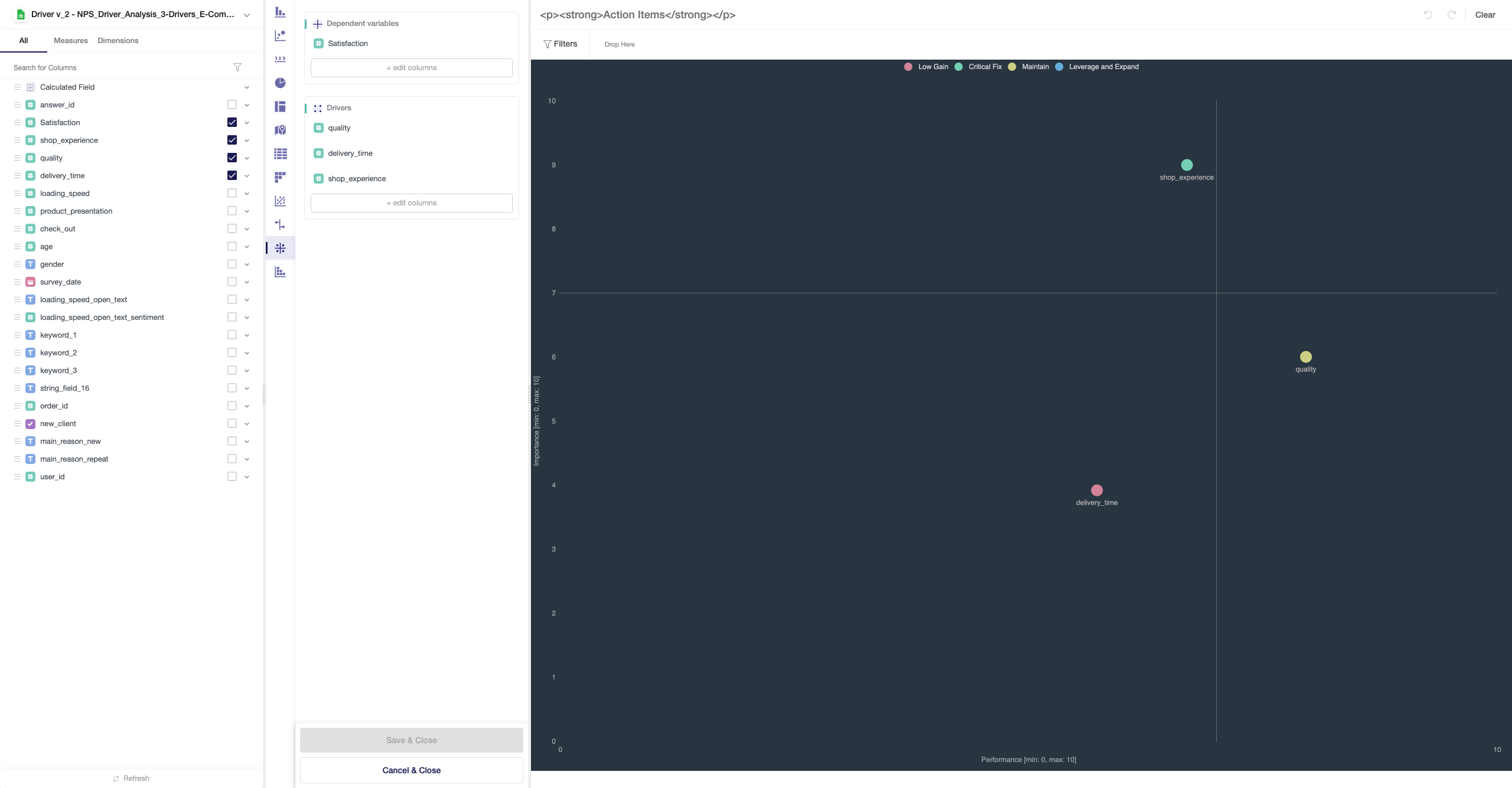 The chart will then perform one regression analysis per driver, identifying the correlation co-efficient (the beta coefficient) between the driver and the key outcome. This provides the value for the Importance axis.
Note: You can also see the Significance level (p-value) for each driver's regression by hovering over the tooltip for each driver
The driver's value in the Performance axis is it's average (mean) score, showing how well that driver is performing individually. In the example above, Shop experience averages 7/10 across all customers.
The results then give 4 different recommendations:
- High Importance and High Performance = Leverage and Expand
- High Importance and Poor Performance = Critical Fix
- Low Importance and High Performance = Maintain
- Low Importance and Low Performance = Low Gain