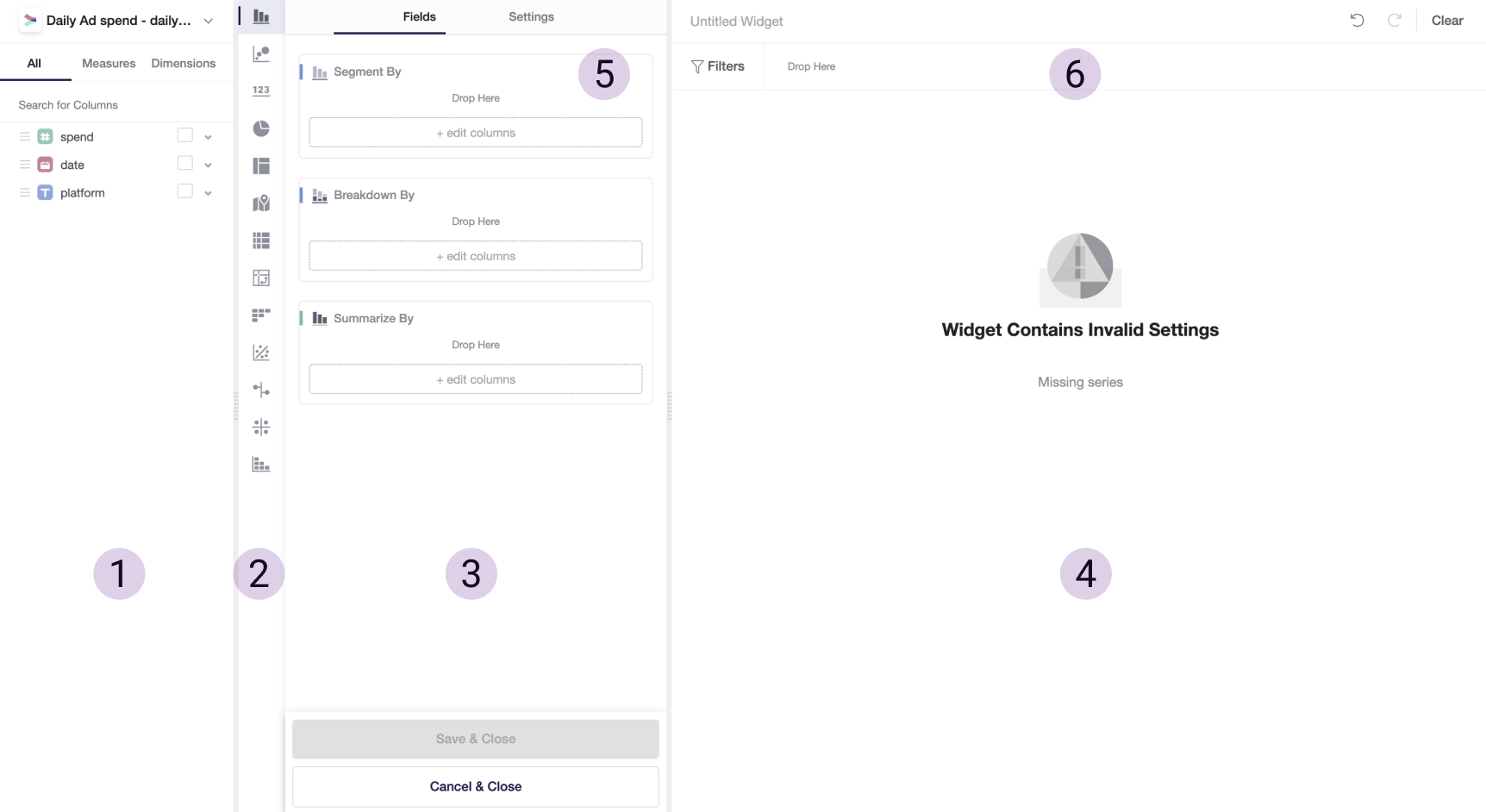
Creating a Visualization
Visualization widgets are the main component of your dashboards and allow you to quickly visualize your data and dive deep into data analytics.
-
Choose a dashboard you want to add a new widget in and make sure you are in Edit Mode.
-
Click on Add Widget to add a new insight widget.
- Select a data table you want to create a widget out of by clicking on the data source and select the tables you want to include. As a data source, you can use raw data or output data modeled in Y42.
Watch the following video for a more comprehensive overview on Visualize:
Widget Menu

In the Widget Menu, you will find the following fields:
- List of variables retrieved from underlying data. Variables are grouped by Dimensions and Measures.
- Dimensions are variables that contain qualitative values, such as names and dates. In your analysis, you can use dimensions to group or segment data, therefore change an aggregation level of data view.
- Measures are variables that contain numeric and qualitative values that could be summarized or counted against dimensions.
- List of widget types. Currently, we support Simple Chart, Scatter Plot, Number Box, Pie Chart, Treemap, Geo Map, Table, Pivot Table, Cohort Table. Additionally, you can perform more complex statistics charts, such as Linear and Standardized Regression, Driver Analysis, and Correlation.
- Field, where you can drag and drop variables for creating a widget.
- Field, where your widget is displayed.
- Settings that are applied on a widget level. Note that these settings overwrite global settings you apply on a dashboard level.
- Filters that are applied on a widget level. To filter out data, drag and drop variables from (1) to (6), and choose parameters.
Read more about each of the widgets types and settings that you can apply in the next articles.
Was this article helpful?