Creating and Editing y42 Dashboards
Creating a Dashboard
A dashboard is a space populated by widgets - visual representations of your data. To create your first dashboard, follow these steps:
-
Click on Visualize in the main left navigation bar
-
Click on Add a Dashboard
-
Name your dashboard, and choose a privacy level
-
Click on Submit
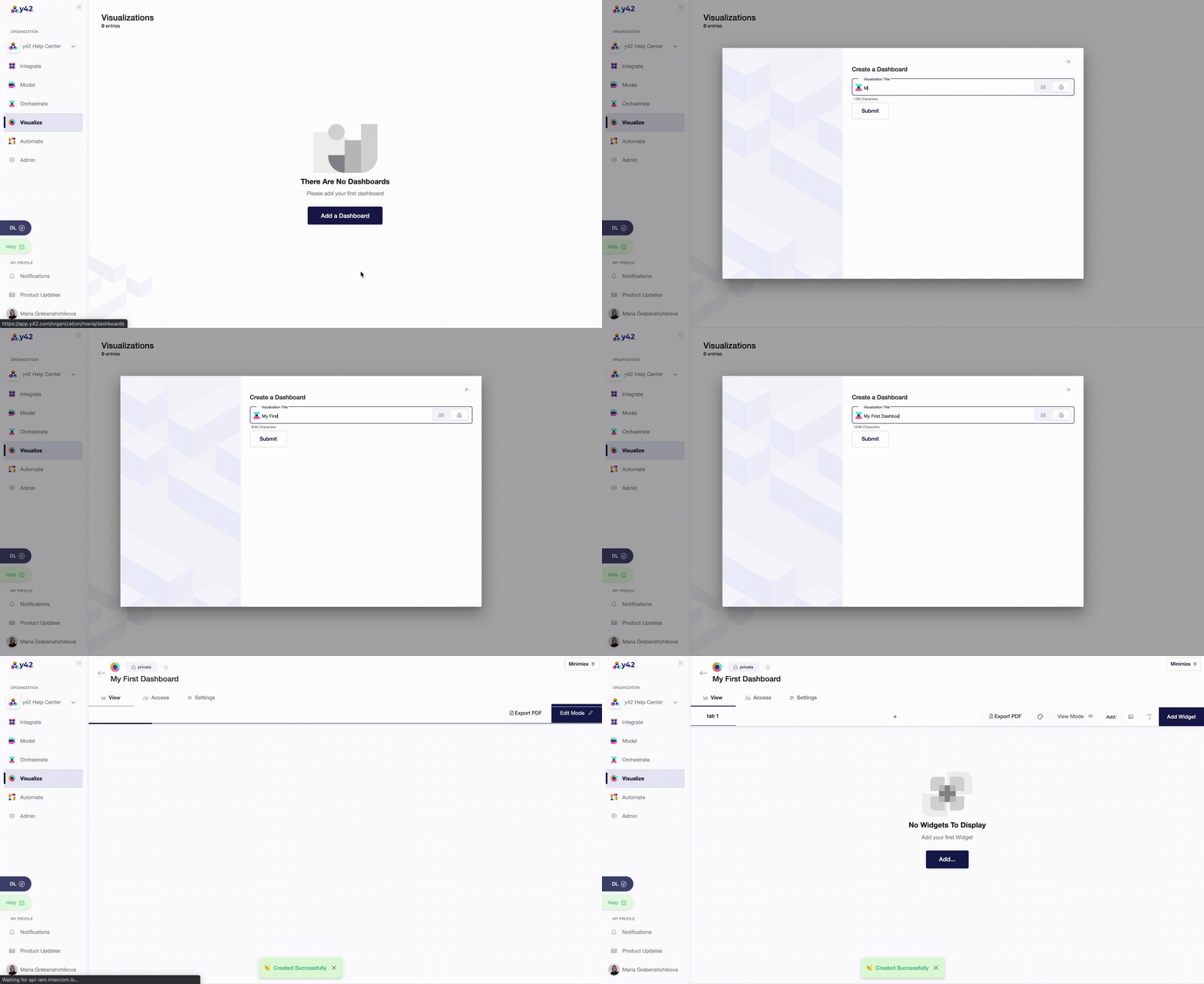 Congrats! You have now created a new dashboard, where you can customize and create widgets.
Dashboard Menu
Each dashboard has three windows: View, Access, and Settings.
- In View, you can create and edit widgets, organize your dashboard through tabs, global themes and filters.
- In Access, you can set different privacy levels of a dashboard (public or private).
- In Settings, you can delete a dashboard if your access rights allow it.
Below, you will find more information about each of three windows.
View
Working with Tabs
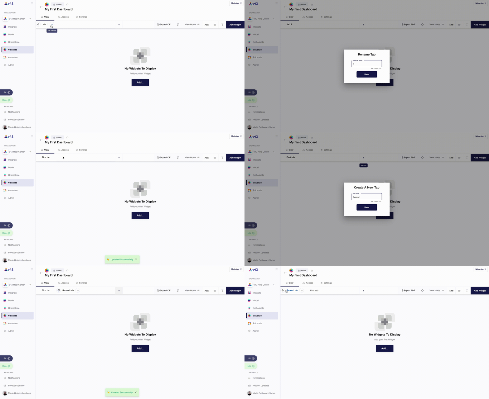
Tabs are designed for you to organize your widgets and group them by different categories. By default, you will be redirected to Tab 1 of your dashboard. You can easily add new tabs, change their order, and rename them.
Editing Dashboards
Every dashboard has two modes: Edit Mode and View Mode. For editing your dashboard, simply click Edit mode, where you will find the following options:
- Edit theme - change visual elements, including colors, axis, legend, tooltip, etc.
- Manage global filter - apply filters to all widgets within a dashboard.
- Change position and size of each widget.
- Add pictures and text blocks.
Important to note: all changes are applied on a global level - to all dashboard widgets. You can also adjust settings on a widget-level separately, when you click on an Edit button of a particular widget.
Edit Theme
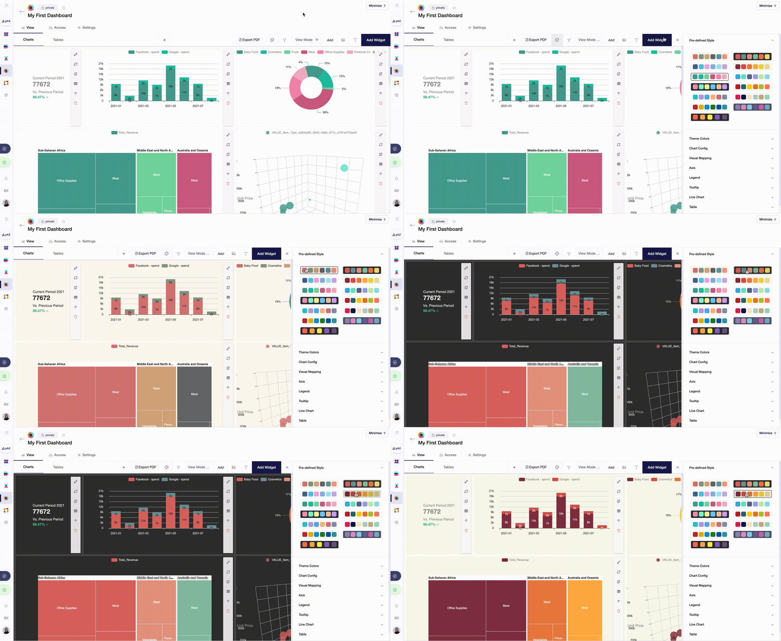
In this functionality, we offer Pre-defined Styles that you can apply to all widgets across all tabs within a dashboard. This may simplify the way you design your report.
However, if you would like to overwrite some of the theme colors, you can do it in Theme Colors, Chart Config, Visual Mapping. You can also customize the way your dashboard looks by changing colors and lines for axis, legend, tooltip, line chart, table, and cohort color.
Change Position and Size of a Widget
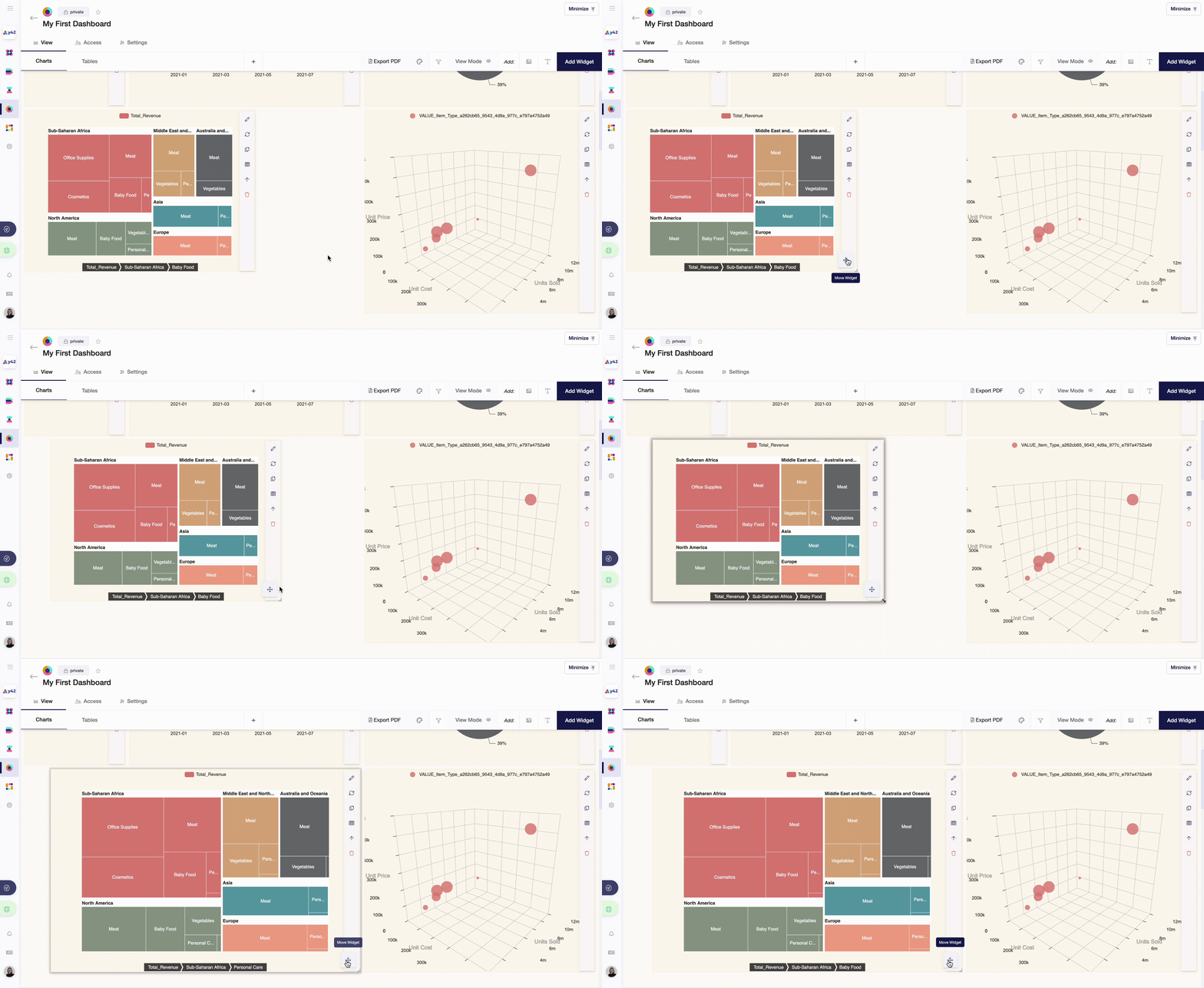
To change the position of a widget, navigate your cursor to it and click on Move Widget. You can also change the size of a widget by clicking on the down-right corner and extending the frame.
Manage Global Filter
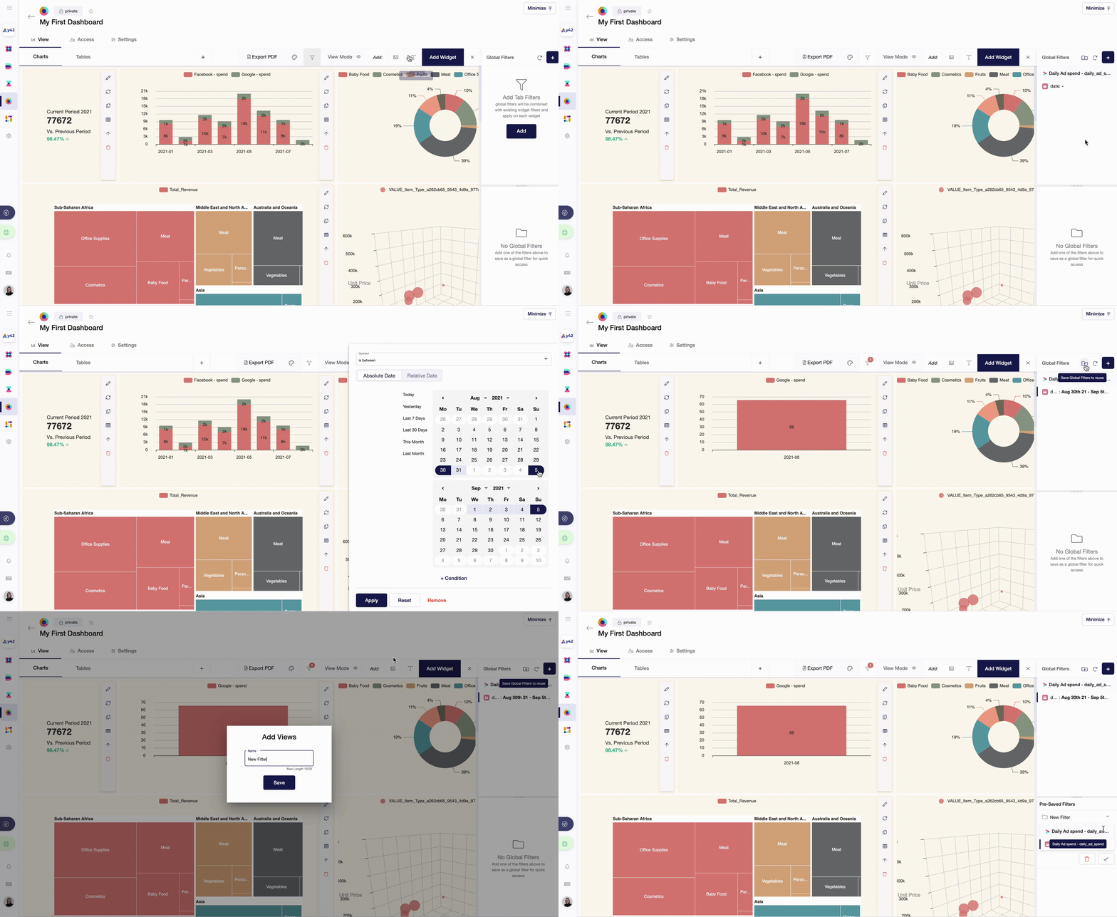
In some cases, you would need to filter all widgets by a certain date, category or boolean variable. This may be helpful, for example, when widgets should show only information about the last 7 days and / or a particular country. You can also save filters to apply them on a constant basis throughout your data analysis.
Add Pictures and Text Blocks
Adding pictures and text blocks extend the visual quality of your report. You can add a company logo or schemas that explain the logic behind the numbers you want to present. Text blocks may improve an overall understanding of your report for external readers as you can add notes about data sources, assumptions, recommendations, etc.
Export PDF
After you created a dashboard and populated it with widgets, you may want to share your findings with others. Export PDF is a feature that allows you to share your reports in PDF format. After clicking Export PDF, you can change a file name, resolution quality and position of widgets.